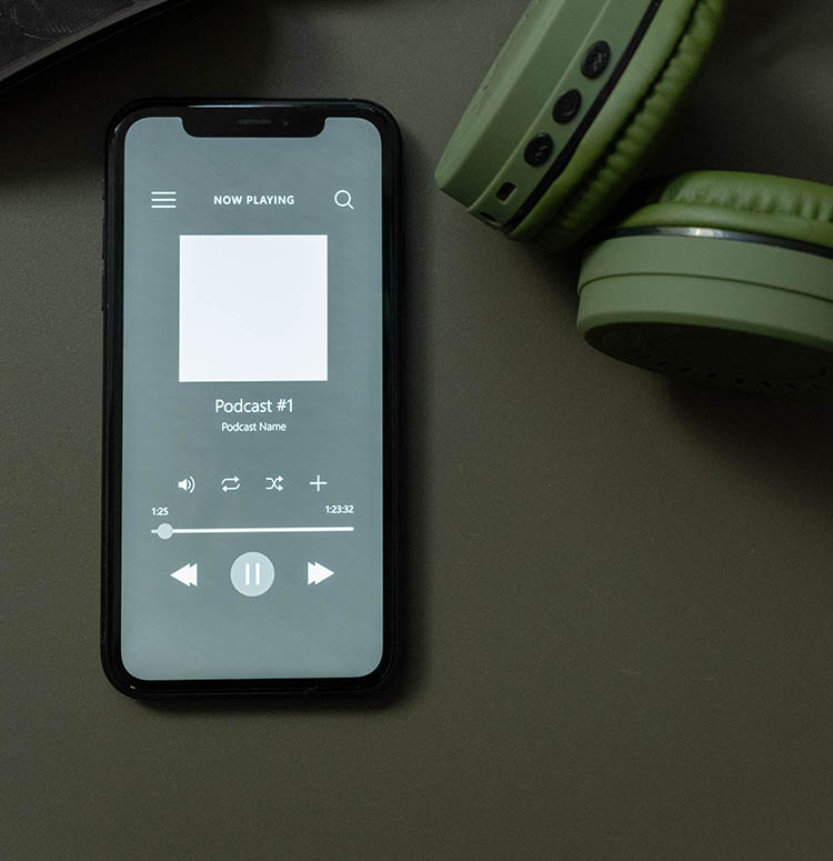
Significance of Eye-Catching Podcast Artwork:
Podcast artwork serves as the visual representation of your podcast and is often the first thing potential listeners see. A compelling podcast cover can significantly impact a listener's decision to explore your show. Here's why eye-catching podcast artwork is crucial:
-
First Impression:
- It's the first visual encounter a potential listener has with your podcast. A visually appealing cover can create a positive first impression and intrigue users to learn more.
-
Brand Identity:
- Podcast artwork contributes to your brand identity. Consistent and memorable visuals help listeners recognize and remember your podcast among the vast array of options available.
-
Visibility in Directories:
- Well-designed artwork can make your podcast stand out in podcast directories. When users scroll through platforms like Apple Podcasts or Spotify, eye-catching visuals increase the chances of attracting attention.
-
Professionalism:
- Professional-looking artwork conveys that your podcast is well-produced and worth a listener's time. It establishes credibility and suggests a level of professionalism in your content.
-
Genre Indication:
- Artwork often gives cues about the genre or theme of the podcast. This helps potential listeners quickly understand what your podcast is about and whether it aligns with their interests.
Tips for Designing Engaging Podcast Artwork:
-
Clarity and Simplicity:
- Keep your design simple and easy to understand. Avoid clutter and ensure that key elements, such as the title and imagery, are clear and legible, even at smaller sizes.
-
Eye-Catching Colors:
- Use bold and contrasting colors to make your artwork stand out. Consider colors that evoke the mood or theme of your podcast. Ensure good visibility, especially when viewed in thumbnail size.
-
High-Quality Imagery:
- Use high-resolution images to avoid pixelation. Whether it's a photo, illustration, or graphic elements, make sure the visuals are crisp and well-defined.
-
Consistent Branding:
- Maintain consistency with your brand colors, fonts, and style across all your podcast branding, including your cover art. Consistency helps build brand recognition.
-
Typography:
- Choose a legible font for your podcast title. Consider the readability of your text, especially when the artwork is scaled down. Experiment with font styles that match the tone of your podcast.
-
Relevance to Content:
- Reflect the theme or content of your podcast in the artwork. If possible, incorporate elements that provide a visual cue about the topics you cover.
-
Consider the Thumbnail:
- Podcast artwork is often viewed in thumbnail size. Ensure that your design remains clear and engaging even when scaled down. Test its visibility in various sizes.
-
Test with Your Audience:
- Before finalizing your podcast artwork, gather feedback from your target audience. A/B testing or seeking opinions on potential designs can provide valuable insights.
-
Adhere to Platform Guidelines:
- Different podcast platforms may have specific requirements for artwork dimensions and file formats. Familiarize yourself with these guidelines to ensure your artwork displays correctly.
-
Update When Necessary:
- If your podcast undergoes a significant change or rebranding, consider updating your artwork to reflect the current state and content of your show.


Comments (0)